Strata Cards
As a Senior UI Designer, I played a key role in shaping the digital experience for Citi’s Strata card portfolio, translating complex financial products into clear, intuitive, and engaging interfaces. I partnered closely with product, UX, and engineering teams to define scalable design patterns, elevate visual consistency, and ensure a seamless experience across web and mobile touchpoints. My involvement focused on simplifying decision-making for users, highlighting card benefits effectively, and aligning the experience with Citi’s broader design system while pushing for a more modern, user-centered approach.

Overview
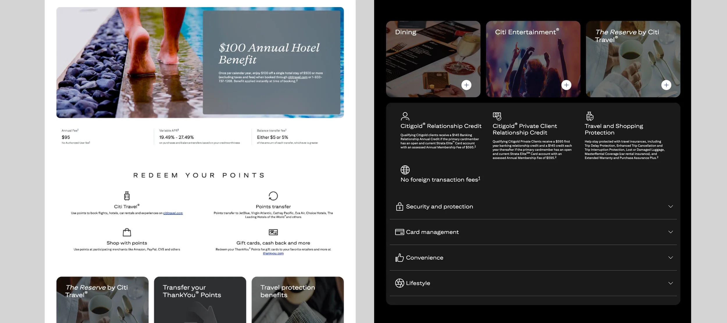
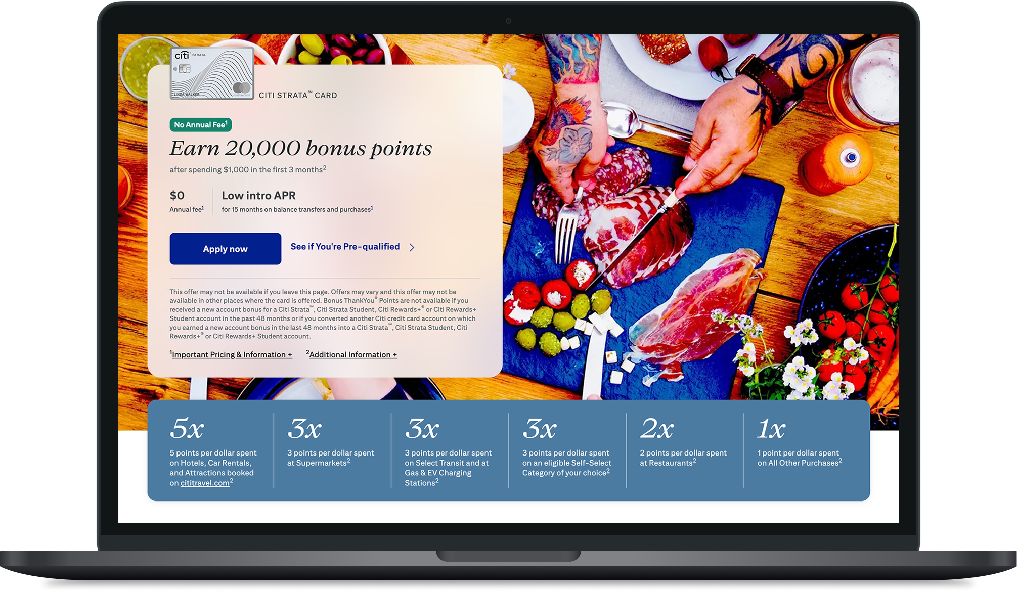
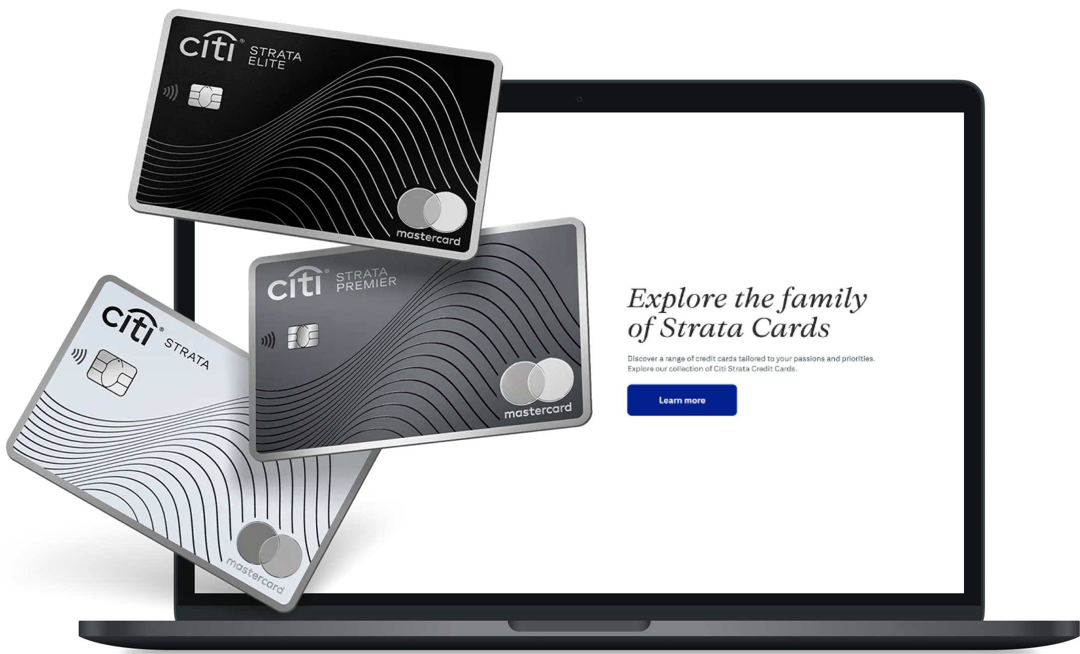
Citi’s Strata card portfolio introduced a tiered set of credit cards with varying benefits and value propositions. The challenge was to present these options in a way that felt clear, easy to compare, and approachable for users making financial decisions.
Problem
Users were overwhelmed by dense information and had difficulty understanding the differences between card tiers. The experience needed to better guide users toward the right card while highlighting key benefits in a simple, digestible way.
Persona 1: The Everyday Rewards Seeker
Wants a credit card that gives clear, useful rewards for daily spending like groceries, gas, dining, and bills. Needs simple benefit messaging and an easy way to compare card options.
Persona 2: The Careful Financial Decision-Maker
Takes time to compare fees, rewards, and card benefits before applying. Needs clear card differences, simple language, and confidence that they are choosing the right option.
Persona 3: The Busy Mobile User
Researches credit cards quickly on their phone and does not want to read dense financial information. Needs a clean mobile experience with scannable sections, clear benefits, and easy next steps.
Persona 4: The Value-Focused Traveler
Looks for a card that supports travel, rewards, and lifestyle benefits. Needs key perks highlighted clearly so they can quickly understand which Strata card offers the most value.
Approach
Broke down complex information into scannable sections
Designed comparison patterns to help users evaluate card tiers quickly
Emphasized key benefits and rewards through visual prioritization
Aligned the experience with Citi’s design system for consistency across touchpoints
Solution
We introduced a clean, modular layout that made it easier to explore and compare Strata cards. Card tiers were presented in a more structured way, with clear distinctions and simplified messaging. The design reduced cognitive load and made decision-making feel more intuitive.
Impact
Improved clarity around card differences and benefits
Created a more seamless and modern user experience
Supported users in making faster, more confident decisions
Established scalable UI patterns for future financial product pages
Takeaway
This project reinforced the importance of simplifying complex financial information. By focusing on clarity, hierarchy, and consistency, we were able to turn an overwhelming experience into one that feels straightforward and user-friendly.
You can view the live Citi Strata Cards experience here: https://www.citi.com/credit-cards/citi-strata-all-cards. This site was designed to help users explore and compare Citi Strata credit card options in a simple, organized way, making it easier to understand card benefits, rewards, and which option may best fit their needs.